Over the past 10 years of scaling engineering teams, one of the most critical time intensive and important topics has been formation of our teams, and I’ve found the ability to visualize team formations and interactions incredibly powerful for identifying opportunities for improvement, dependencies, etc.
The framework introduced in Team Topologies: Organizing Business and Technology Teams for Fast Flow does a fantastic job of capturing these essential elements of team formations and has been my go-to book recommendation for other engineering leaders over the years.
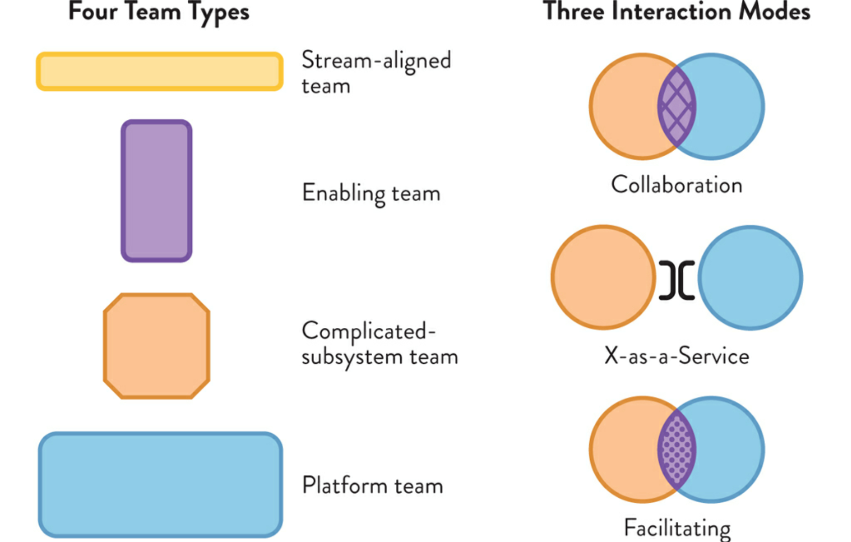
The visualization format used in the book is fairly effective for laying out the team formations, but after putting it into real-world usage with a fairly large organization (100+ engineers and 15+ teams), I ran into a few specific shortcomings:
- Platform teams are a common dependency across multiple teams, and the interaction visualization got messy very quickly.
- Facilitating and Collaboration interactions are constrained to only map to a single team. While this may be a strong recommendation, it is a limitation that prevented rendering the reality of teams with multiple interactions.
- Missing critical information around “size” of teams. One of the most common bits of information when discussing org design is the “amount of investment” in each value stream. This is easily visualizable.
After some ideation and experimentation, I found visualization via a graph network to hit the sweet spot to showcase the full spectrum of teams + interactions + amount of investment in each team.
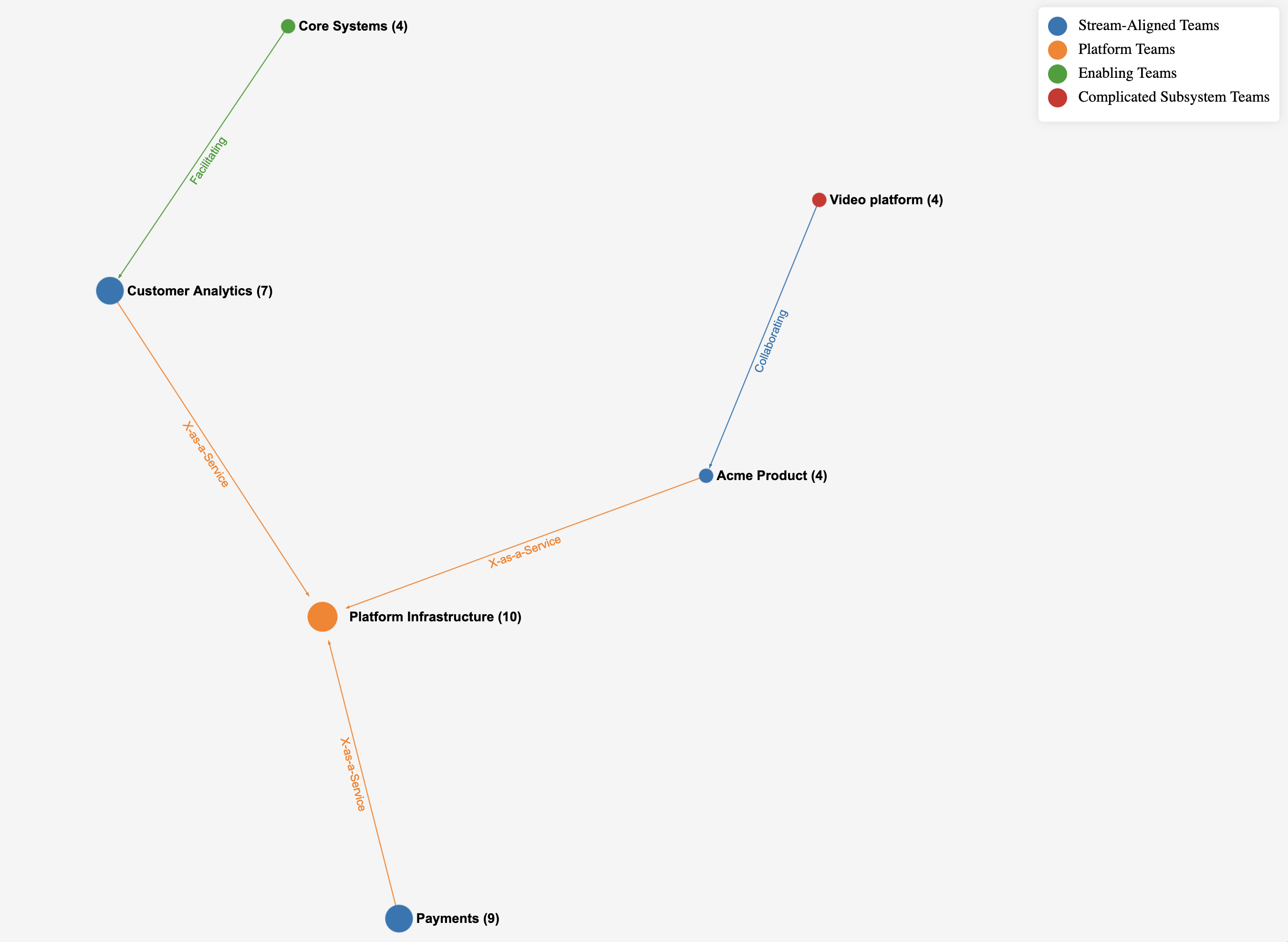
With just an hour hacking away (thanks to rapid prototyping support via Cursor), I was able to whip up a proof of concept app that “scratched my itch” and is extensible to support any permutation of teams via a simple JSON configuration. The code is 100% opensource, and if you’re interested to give it a run, I welcome any feedback for improvements!